It’s a design goal we all share: How to make a room look bigger. And not just bigger—but expansive, flowing, and more open. We want our homes to be both beautiful and comfortable, where there’s as much space for our furniture and favorite décor as there is room to breathe and be. One foolproof way to nail this? Paint. There are certain colors that make a room look bigger just from how the pigments reflect or absorb light. It’s design magic.
One of the coolest aspects of interior paint is how it adds more than simply color to a room. Wash a home office in a blue-toned gray and suddenly there’s an imbued sense of calm. Douse a kitchen’s walls in terra cotta and you can feel the warmth and jovialness instantly. Paint a small living room in a moody iron-gray, which designers Wendy Robinson and Lyndsay Scott recommend below, and the walls will seem like they’ve pulled back to allow more air and light.
Simply put, paint can be a magician. A tool that transforms swiftly (and economically!). And in the case of tricking the senses into making a room expand beyond its square footage, paint is Houdini. Read on for three design experts’ top room-stretching paints for the home. Plus, their tricks for taking the color game to the next level.
Feature Image by Kate Zimmerman Turpin
Before we get to the paint colors, what are other ways we can make a room look bigger?
#1: Paint the Entire Room
Most painting tricks to make your room look bigger involve choosing the right paint color but there are other tricks as well that you can use to make a room feel larger, says designer Lyndsay Scott. The first is painting the room all the same color including the woodwork, ceiling, and door. This trick works best when you oscillate the finish of the paint to add dimension. “For example, on the walls, we love using Chantilly Lace in an eggshell finish, and also Chantilly Lace on the woodwork and doors but with a satin or semi-gloss finish,” Scotts says. As for the ceiling, Scott and her co-founder and co-designer Wendy Robinson say to continue the use of the same paint color, but lighten it by about 20 percent. “This way, you are less aware of where the walls end and the ceiling begins.”
#2: Opt for an Eggshell or Satin Finish
Natural light makes a room look bigger. This is a fact. So how do you optimize this? By incorporating paints that have a subtle glean that reflects and bounces the light. The subtle gloss of eggshell and satin finishes do just this, capitalizing on rays by putting them to room-widening use. If you want to go bolder, consider a semi-gloss.
#3: Create a Contrast
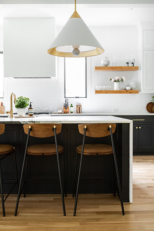
Opposites attract—and they also complement. Designer Susan Wintersteen suggests creating a look that incorporates more visual impact, which will then draw the eye and create the illusion of more space. One way to do this is by painting cabinetry in a deep moody shade, such as a navy, and contrasting it against fresh white walls.
Keep scrolling to discover the 5 paint colors that make a room look bigger.
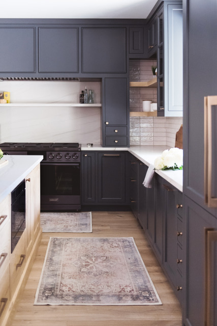
#1: Deep Navy
Rich colors have an uncanny ability to add drama to a room, says Susan Wintersteen, CEO and principal of Savvy Interiors. “My preference for making a space feel larger is a deep, moody shade.” These feel grand and luxe, Wintersteen continues, and they ground a room, making it seem larger than it is. Her preference is a navy blue slate that is so deep it borders on black. When you pair this with either a lighter wall or accents, “complemented by warm wood tones and abundant natural light,” the result is timeless, comforting, warm—and ultimately expansive.
Paint Pick: Farrow & Ball Scotch Blue
Best for: Kitchen and living room.
#2: Greige
As its name suggests, greige is a neutral color that exists in the middle of gray and beige. I admit: I’ve always been a little wary of this color: Can’t it just be one or the other? But after Jessica Nicastro recommended it for stretching a room’s capacity, I saw greige in a different light. “Greige is timeless and warm,” the founder and principal designer of Jessica Nicastro Design believes. It’s technically a light and bright shade, which naturally adds and bounces light rays. But greige also has the depth of a gray and the earthiness of beige, resulting in a hue that is equal parts cool and warm, and grounding.
Paint Picks: Farrow & Ball Shaded White and Portola Paints & Glazes Piano Room
Best for: Kitchen.
#3: Clean White
It’s an obvious pick for a reason. Light colors make a room look bigger because they reflect the light, says Wendy Robinson, who offers a little science as to why. “There is a measurement called light Reflectance Value that defines the percentage of light reflected off a painted surface on a scale of one to 100,” the co-founder and co-principal designer behind How We Haven tells me. An LRV of 100 would be pure white, she continues. “This is way too stark for a room”—but you get the gist. White reflects light and broadens a space’s capacity. Robinson and her co-founder and co-principal designer Lyndsay Scott choose whites that are a bit lower on the LRV scale, say around 80 to 90, so they have a bit more warmth.
Paint Picks: Benjamin Moore Chantilly Lace and Benjamin Moore Dove White
Best for: Any room!
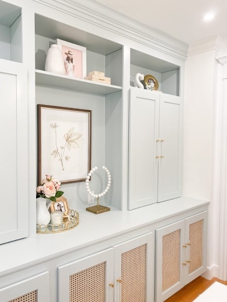
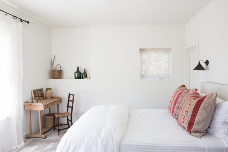
#4: Light Blue-Grey
Staying on the light-hue train, the intersection of pale blue and chalky gray is a winner for enlarging limited space. Because it contains high levels of white, it reflects ample light, as Robinson and Scott tell me. It also has a more serious tone of grey, which continues to lend a grounded vibe. Think of the wide-open sky on a cloudy day: It’s endless and expansive with a hint of texture from the clouds.
Paint Pick: Benjamin Moore Pale Smoke
Best for: A home office or bedroom.
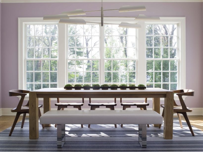
Image by Susan Bednar Long
#5: Violet
It is one of the biggest paint trends of 2022: a light shade of joy-inducing purple. As Susan Bednar Long of SB Long Interiors tells me, soft violet is a winner for its ability to calm the senses and evoke feelings of positivity, all of which simultaneously opens a room to make it seem bigger. Violet is reminiscent of spring, Long says. A time of growth, regeneration, and bounty.
Paint Pick: C2 African Purple
Best for: Dining Room